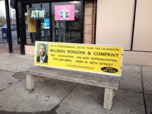
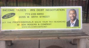
When you’re in business, effectively engaging your prospects and potential customers is half the battle of generating revenue. However, when you communicate via different advertising media (e.g. TV, radio, internet, outdoor, etc), you have to make sure that the design has been properly tailored. If the ad design doesn’t match the media, you risk the possibility of losing a lot of money. Case in point; our bus bench ads.
In 2014 we began using bus bench ads to extend our marketing reach around our retail office. While the bench didn’t “break even” from the standpoint of how much we spent on it versus the revenue generated, it did bring us some customers. With that said, we went back to the drawing board when it came time to redesign it for our contract renewal. Why? Well, we felt that the original version may have been a little too “busy” and cluttered. Thus, we tried to streamline it so that it delivered our message in line with the media (i.e. quick view, limited space and only a few seconds to capture your “on-the-go” audience).
Designing for outdoor media is a challenging communication task. It requires that one transmit their concept with both clarity and focus. With that being said, here are the top ten points to keep in mind when developing effective outdoor advertising:
The Five W’s. You want to convey the what, where, why, when and who in the most expedient manner possible. Some of you may say that the w’s aren’t in the order that you remember them in from school. Well, when it comes to advertising, the prospect wants to know what’s in it for me before they even care who is offering it. Thus, tell them what you’re offering, where they can get it, why they need it, when they can buy it and who you are in that order. They can always find out who you are, but that isn’t going to initially spark them to continue reading your ad.
Keep your message short. Refine your message to its most basic elements; you may only have 30 seconds of their time if you are lucky. You’re NOT trying to sell them on the spot so don’t waste your time or money attempting to do so. Remember, you just want the person to desire to learn more about the goods and services of the company so they will follow your call to action.
Use a “call to action.” The main reason businesses fail to make the sale is because they never ask for it! If you want the person to do something, explicitly tell them what steps they should take. Things such as call now, visit this website or visit us at 123 Anywhere Street are what we’re referring to. If your space is limited, at a bare minimum the ad copy should be designed so readers have the essential information and are stimulated to respond.
Use bold, vibrant colors. Colors that complement and contrast each other work best. Using more than two or three different colors isn’t advisable. Designs have better readability with opposite colors used next to each other for higher contrast. With colors that are too similar, design elements can blend together at a distance and get lost.
Eliminate unnecessary information. You’re probably not advertising services from Chicago to prospects in Florida. Thus, eliminate items such as area codes and city names if they aren’t absolutely needed.
KISS. Keep it simple sweetheart! Limit the complexity and number of concepts communicated. The more that prospect has to digest, the harder it will be for them to remember just what it is you do.
Use photos and graphics. There is a reason that Jared’s picture is on the benches. Pictures help to create intrigue, convey mental images as well as help an ad stand out. For example, if you see the bench with Jared’s face on it, you might just look at it simply to satisfy your curiosity as to who that guy is? Ads with images are viewed far greater than those with only text, so make sure to use those pictures!
Use large, clear fonts. You want to ensure that you copy is readable; especially for the most important concepts of the ad. In our first generation benches the company name was the most prominent. In the second generation we changed this so that our services were primary. Why? See the five w’s above.
Use intrigue. Make your prospects want to learn and know more about you and what you have to offer. Thus, be intriguing in both words and imagery.
Keep the layout simple. Remember, you’re trying to say a lot in a little amount of time. Make sure that the layout is clean with a clear-cut message and focus. Remember less is always better.


